Couple. We develop an app for our customers. Then almost every project starts with the development of a clickable prototype. Designing a clickable prototype is, as it were, the foundation of the app on which important decisions are made. These decisions are all about the ultimate usability of the app and its features. This has been our design process over the years and has been perfected by our design team.
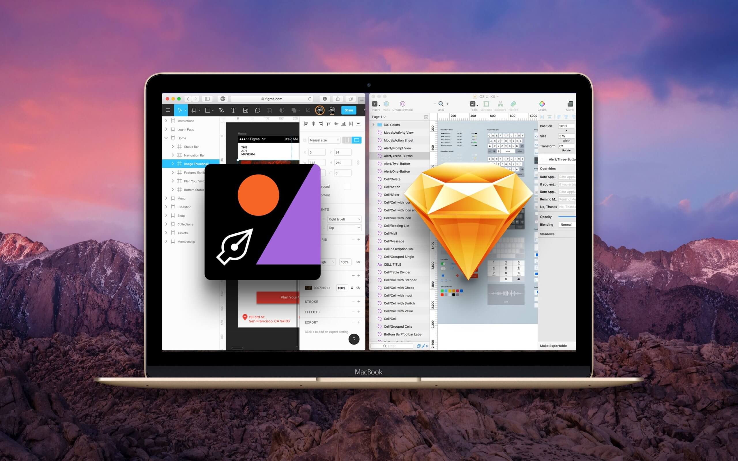
Our designs are designed with the Sketch program, and then made clickable and delivered in InVision. In recent years, this has been a working method that perfectly meets the needs of our customers. It gives the clearest possible picture of the end product. Still, we may be going down a new path. As innovative developers and app designers, we are at the forefront when new tools are available. This time there is a new kid on the block for the Coffee IT design team. We therefore explore with the UI design tool: Figma.
What does the design process of our apps look like?
Before we discuss our new possible design tool, it is good to briefly explain what our design process looks like. Our team of designers has been designing the most diverse designs for over five years. Because we make apps for a wide range of diverse customers and industries, our design team must have a good dose of creativity and empathy. Already during the design phase, we start by inventorying and integrating the house style, logos, core values and all associated matters that the customer wants to radiate with the app. Due to our specialization in app development, we know the requirements of a distinctive and successful app design. In addition the design of the app tested with user tests and further optimized.
Globally, the design process of an app looks like this:
1: The sketches (concept formation)
2: Prototypes and style impression
3: Final design (release time!)
The sketches
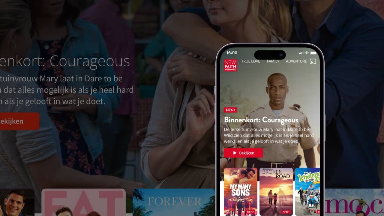
The sketch phase includes the inventory of the customer's wishes and the needs of the end user of the app. Based on the first conversations, sketches are made in the design tool Sketch*. During this phase, the emphasis is placed on the overall tone of the app and whether all elements are logically structured for the user. This is also a good time to check whether we have properly understood the client's vision and whether we can translate that vision into a successful app.
*Did you know that Sketch was founded in 2010 by a Dutch company called: Bohemian Coding. In 2013, it won the Apple Design Awards. It is still one of the most used design toolkit by UX and UI designers.
The prototypes and style impression
This is the part where our designers can really unleash all creativity. The first prototypes are made based on the sketches in Sketch. After some back and forth contact with the client, the idea of the app is made visible and clickable in InVision. The client also has access to the prototypes and wireframes, so that changes can be made quickly. The style is determined on the basis of the house style, documentation and branding.
final design
The dots are being put on the i and the champagne is in sight. A complete and clickable design shows what the app will look like in the future. The final design can be tested, by the team and by users. The result: an almost ready-made vision of the end product in a clickable prototype.

Why are we considering moving away from this UI design process?
Not only we as app developers innovate, the technical field in which we work changes at least as quickly. A lot has changed in the development process over the years. InVision and Sketch have not kept up with all these changes quickly enough in our opinion. For example, there is no support to design Dark Mode as it must be implemented by our programmers. In addition, we cannot design animations and screen transitions in these tools to give the programmers and customers an even clearer picture of the design team's vision.
The prototype InVision is used by the app developers as a source of information. This way they can see the fonts, colors and spacing that they ultimately have to build in the app. However, because Sketch and InVision do not communicate optimally with each other, this is not always possible. For example, when Sketch adds a new functionality, InVision is not always set up for this. Our development team soon asked if there wasn't a more efficient tool for the transfer, because InVision was increasingly giving ambiguities about information that is crucial for the development team. Our UX and UI designers also benefit from a program with more functions. Both Sketch and InVision have stood still with new innovations in recent years, while the competition has caught up with them.
Welcome to the design team: Figma!
It's time to try something new. We found a tool that merges Sketch and InVision into one product: Figma. This interactive UI design tool combines design, prototyping and delivery to the developers team in one. This may make this tool more efficient for both our internal app development process and for our customer.
There are several benefits of Figma:
- All designs are in the cloud
- Multiple designers can work on a design at the same time
- The clickable prototypes can have animations
- Dark mode support in one design
- The development team has access to the full design
- It also works on Windows and not just Mac like Sketch
- Design screens can be added to Jira issues by the team and by customers for greater clarity
figma vs. Sketch
Sketch versus Figma, which program is most suitable as a UI design toolkit? The battle is fierce between the designers and there are advocates for both camps. And rightly so, both programs are excellent tools for designers to explore and create user-friendly designs. As far as we are concerned, the real distinction between the two only comes into its own when we talk about designing complex wireframes and designs.
Figma was created in 2015 and is a vector-based design software that makes it possible for designers and designers to work on a project at the same time. As far as we are concerned, this is the main reason for switching to Figma as our main UI design tool and replacing Sketch. In addition, it is not only accessible to Apple users. Elements that Figma is strong in are:
- Graphic design
- Prototyping
- UI & UX design
- templates
- Wireframing
Combine this with our aforementioned argument: the collaboration, the fast workflow and the space saving on your hard disk (UX and UI designers know this problem), and you have a smart design tool. A small downside of Figma: the number of plugins offered by Figma is very limited compared to Sketch, for example.
Sketch on the other hand, it has not been nominated for best design app by Apple for nothing and is equally known as 'the digital design tool'. Sketch's design resources are huge. Sketch's library makes it possible to start programs or projects quickly and easily, without having to start from scratch. In addition, Sketch has a huge community, cloud support and endless material of inspiration.
Have we already switched to Figma?
We will not immediately switch from our current work process with Sketch and InVision to Figma. We will first test whether Figma is actually more efficient for us and our customers. Our current work process has proven to be a good and validated method. If it turns out that the new design tool Figma does not provide enough benefits, we will stick to our current working method. Our UX and UI designers will therefore first try out a trial with the new tool before we make the final switch.
Curious about our further experiences or have your app designed with Figma?
There is a good chance that you have become so inspired after reading this article that you want to get started with Figma yourself. You can download Figma for free for a trial period at this link. Would you like to know more about our design and app development process or could your app use an update? Then take it without obligation contact contact our team, we will be happy to help you.